I am no
Polanksi or anything, and my camera is pretty weak, but that didn't stop me from capturing shots around Whistler. Whenever I saw some type of story possible I pressed record. Below are the results of the day and some findings I discovered along the way...
First up is my favourite house on my morning walk. Here I learned that, just like any story, each shot has a beginning, a middle, and an end. We start off with a view of the brook to give the audience an idea as to the type of environment we're in. The camera catches a car (invisible here) moving across the bridge, which causes us to change panning directions. Finally, the car speeds out of frame, leaving the audience with a view of the house where the car is supposedly headed.
Below are the quilted BGs. One as the camera sees it, and another with a potential (but very crude) animation layer.


The following shot is a little more complex, but once I put it together it made a lot more sense. The idea is that we are following the character up the stairs and around the corner to the phonebooth. In the end, the trickiest part (aside from warping the layout properly) would be making sure the character maintained its volume and stayed planted on the ground. I have to thank the
English Patient work I did for helping me with that task.


This was a happy accident. I just wanted to film a busy intersection to contrast with the peaceful mountains, but when the Purolator truck entered the frame a better story developed; it seems like the Purolator truck is delivering something up the mountain! lol Lesson here: what is at the beginning of a shot will unavoidably relate to the end of the shot, and vice versa.

Next up, I discovered that it looks really cool to move from an interior to an exterior. It feels really sneaky, as if someone has a secret or someone is the target of an evil plot. Here I thought it looked like the protagonist (again, invisible, but seen in crude drawings) was sitting on a bench inside with his reflection in the mirror while the antagonist was making a call to his boss on the payphone to say "I got him".
Also, it's awesome that you can move from a bright set to a dark set in one shot.


You know, there are much fewer verticle pans than there are horizontal or diagonal pans. Perhaps we don't look up or down as often as we stare straight ahead. Here, I stood on a bridge and caught this cyclist from above and followed him into the distance. Creepy...maybe...yes--but effective.

And finally, another deceptful-looking shot moving from an exterior to an interior this time. I'm not sure if I nailed the porportions of the character or not, but you get the idea. It seemed to me like he was going to his car to begin a mission.
It's key to remember that the character continues moving even when a large forground element covers him. He will most likely change porportions and/or direction by the time he gets out the other side.


And there you have it! After this first session I feel a teensy bit more knowledgeable and hopefully next time out in the field I will be able to capture more ambitious shots.

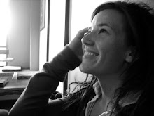
 It's been a lot of cinematography talk on here lately, so I thought I should post a sketch. One of the many Whistler patios in the sunshine. We are so spoiled here, and it's hard to focus on producing artwork when there are lakes and mountains calling your name. Plus, when you only get four months a year to travel, be active, and gain some alternative input (not that Oakville isn't stimulating enough) then you better fill your cup while you can, y'know?